Eyeliner colour by eye colour: what actually makes eyes stand out
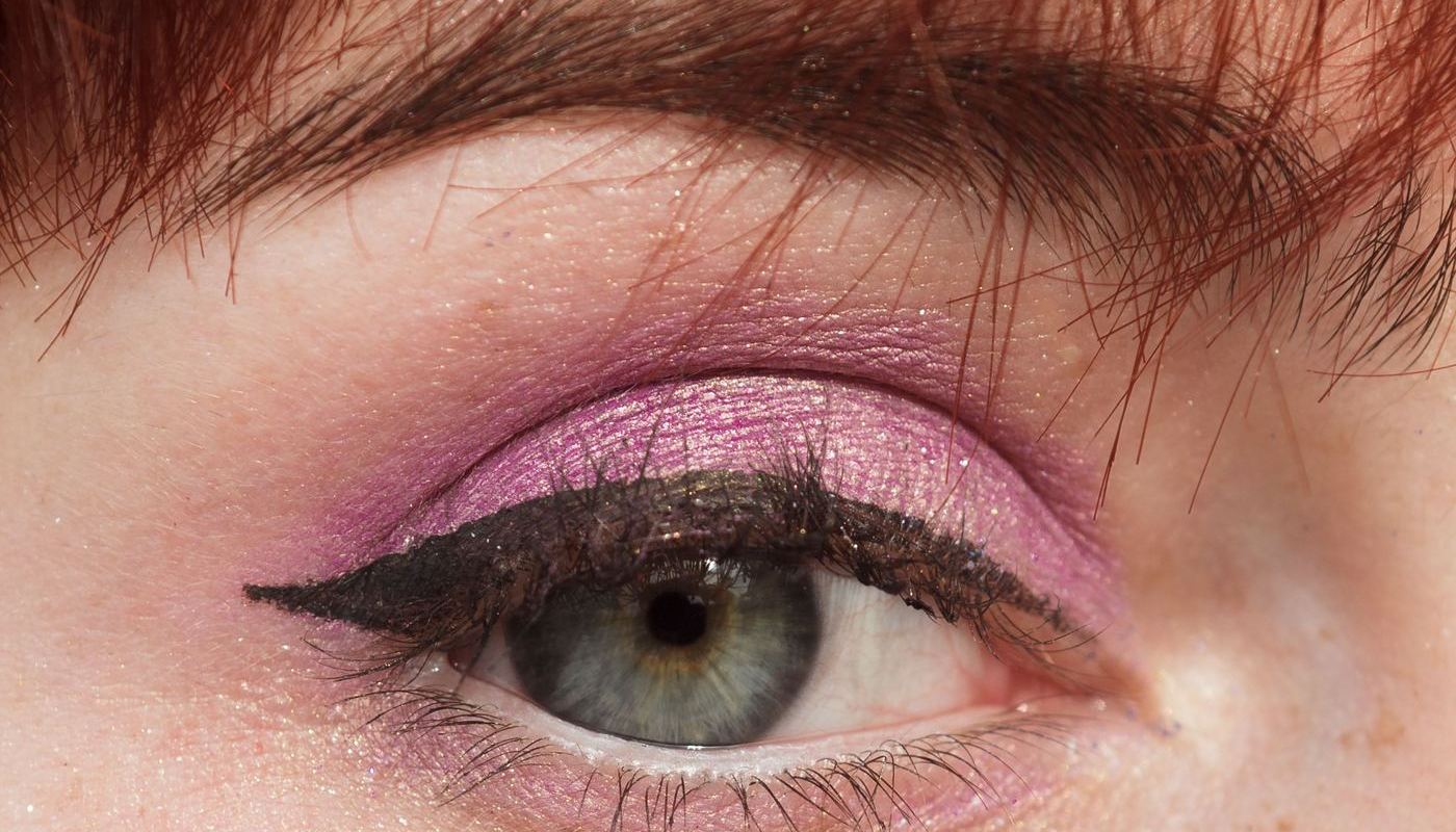
There is one piece of colour theory behind all of this, and it takes a sentence. Liner is the only makeup that sits directly against the iris, so its colour is read in comparison with your eye colour. Choose a shade near your iris on the colour wheel and the two blend, which mutes the eye. Choose one opposite it and both look more saturated.
That is why blue liner does so little for blue eyes, and why copper does so much.
Brown eyes
Brown has the easiest job and the least obvious answer, because a brown iris is a mid-tone that nothing clashes with. Everything is technically wearable, so the question becomes what effect you want. Bronze and warm gold brighten and warm the eye. Deep teal and navy give a cool contrast that makes brown look richer without going anywhere near a novelty colour. Plum is the underrated one, especially on warm and amber-flecked browns.
Black is not wrong here, it just does something different: it defines the eye's shape rather than lifting its colour. Wear it when the shape is the point, as with a graphic wing.
Blue eyes
Orange sits opposite blue, so the whole warm family is the answer: copper, bronze, warm brown, burnt orange. Copper on a mid-blue iris is close to a cheat code. The mistake almost everyone makes at least once is navy or blue liner on blue eyes, which reads as one continuous blue-grey area and drains the iris of its own colour.
Pale, cool blue eyes can be overwhelmed by hard black. Deep brown or charcoal keeps the definition without the weight.
Green eyes
Red-violet sits opposite green, which is why plum, burgundy and warm reddish browns work so reliably. Bronze does a subtler version of the same job. Green liner on green eyes is the equivalent of blue on blue: technically coordinated, visually flat.
Hazel eyes
Hazel is a mixture, so you get to choose which part of it to bring forward. Forest and olive greens pull the green out. Violet and plum pull the golden-brown forward by contrast. Antique gold flatters the flecks and warms the whole eye. Hazel is the shade that rewards owning two liners rather than one.
Grey eyes
Grey irises are low-saturation, so they take contrast in value rather than hue: charcoal and deep pewter give definition without competing. Teal is the one saturated colour that consistently lifts grey, because it pushes the iris towards blue.
Summary table
| Eye colour | Try | Skip | Why |
|---|---|---|---|
| Brown | Bronze, deep teal, navy, plum | Nothing much | A mid-tone iris tolerates every hue, so choose by effect: warm shades brighten, cool shades enrich. |
| Blue | Copper, bronze, warm brown | Navy, blue, icy grey | Orange is blue's opposite. Blue-on-blue merges the liner with the iris. |
| Green | Plum, burgundy, warm brown | Green, olive | Red-violet is green's opposite. Green-on-green flattens. |
| Hazel | Forest green, violet, antique gold | Muddy mid-brown | Hazel is a blend, so pick the liner that isolates the element you want to show. Mid-brown is too close to all of them. |
| Grey | Charcoal, pewter, teal | Pale silver, pale taupe | Low-saturation irises need value contrast. Pale cool shades disappear against them. |
When to stop reaching for black
Black is the default because it photographs well and reads at a distance. It costs you two things. It flattens iris colour, and it shows every irregularity in the line, which makes it the least forgiving shade to apply. Deep brown, charcoal, navy and aubergine all give you the same definition with a softer edge, and they are easier to wear on mature lids, where a hard black line settles into fine lines more visibly.
How to test a shade before you buy
- Swatch on the skin beside your eye, not on the back of your hand. Context is the whole point.
- Check it in daylight, near a window, not under retail lighting.
- Look at the swatch with your eyes open and your head straight, from arm's length. Colour that only works at ten centimetres is not working.
- If you are choosing between two, put one on each eye and photograph both.
Once you know the family you want, the format decision is separate and it matters more for wear: see types compared for how liquid, gel, pencil and kohl differ, and our shortlists by format for specific products.
Questions people actually ask
What colour eyeliner makes brown eyes pop?
Bronze and warm gold for brightness, deep teal or navy for cool contrast, plum for warm browns. Black defines the shape rather than lifting the colour.
Does brown eyeliner look better than black on everyone?
Not better, softer. Brown reduces contrast against the lash line, which reads as more natural in daylight and less defined in photographs. Many people end up owning both for that reason.
Can I wear coloured liner to work?
Placement decides that more than shade. A thin coloured line tight to the lashes reads as a subtle change in eye colour; the same shade in a thick wing announces itself.
What about coloured liner on the lower lash line only?
It is the easiest way to wear a saturated shade, because the iris sits directly above it and gets the contrast without the line dominating your face.